Devlog 1 - Doctrine
DEVLOG 1 - Doctrine
New Features

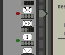
There is now an indication of the redesigns required for the current month(red) and the ones scheduled for next month(green), I found this to really help with planning of the problems to tackle.

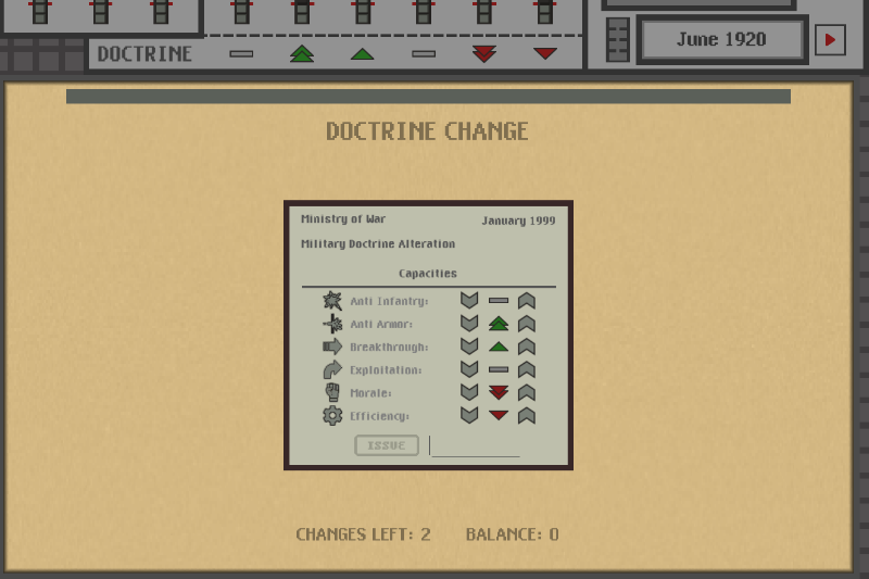
I changed the Doctrine icons to be more readable and easy to interpret, I liked the "pyramid" style they had but they were clearly hard to read. I also removed doctrine from Industry, this was something that I was still considering but I have found that having Doctrine influence both Industry and Capacity would create confusion in the Final Calculation of the Armed Forces. Speaking of Final Calculation, it is now fully working and everything is calculated together. I'm quite happy with the values I'm obtaining from test runs just from the initial situation that is generated to the player and picking random designs. From the image you can also see the Bulletin in action showing a message to the player indicating that the Military Staff has setup the Initial Doctrine as well as when the player will be allowed to change it. This Bulletin now also has a small animation that makes messages quickly show up from the top, just a nice touch I have found.

The Doctrine changes are also fully working, every 6 months (starting in June of 1920) the player is allowed to make a change to the Doctrine, that is, increase the emphasis of one capacity by 1 and decreasing other by 1. As such the Doctrine must always be balanced, there is 1 negative for each 1 positive. The player wont have many chances to perform these Doctrine changes, as such these are very important to consider and plan carefully.

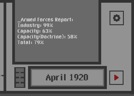
The Bulletin will now also give the player an accurate report of the armed forces every 4 months. This indicates the Industry Coverage, the Capacity Coverage, the Capacity Coverage with Doctrine and the Total. This should help the player to more easily identify the bottleneck between Industry and Capacities as well as verifying if the current Doctrine is improving or worsening the Capacities.
Under the Hood
The starting data was changed to 1920, this has no real impact besides making more sense technology wise. Initially I set the starting year to 1915 and planned to let the game run into the 1920s however overtime I came to the conclusion that that would be too many turns and essentially negate most of the first turns decisions.
Thoughts
I'm quite happy with the progress on the Doctrine implementation, it has been on my list of things to do for quite a while and I've been avoiding it to do other less overwhelming tasks. I have been considering ditching the Design Report presented under the Design Proposal, from my experience I rarely look at it in my test runs, its purpose is to more finely indicate the quality of the design, however all that information is mostly meaningless, there is nothing the player can do to improve it nor can the player use that information for anything. Internally I think I will still keep the variation of values for the estimates as this creates some interesting fluctuations. I will certainly need to think more about this. I also have some other ideas over the table like the possibility of doing an early redesign every X months. I have conflicting opinions on this, in certain situations I can see the importance and necessity to do it, while at the same time I want the decisions to carry a lot of weight so I don't want the player to have an easy escape for his poor planning. Perhaps I will keep it to the side as a possible feature if later on I find the game to be too hard. For the next task I will start tackling the actual war start and looking into the Final Armed Forces value that will shape how the war progresses. This is the main part of the balancing of the game and will be an interesting task that will probably span multiple Devlogs due to its complexity and likely frustration.
Extra

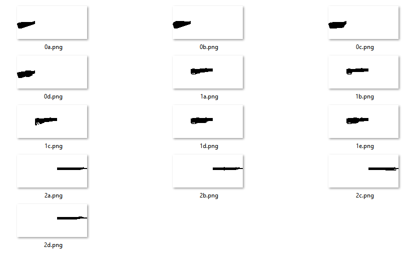
The textual description of the designs by their characteristics quality has proven to me to be quite a powerful tool to let the imagination run on how each design looks like. However an image is always more powerful than words and ever since I started prototyping and developing this game I always wanted to have some sort of visual representation of what designs look like. After trying many options to approach this I have finally found a system I think has a good balance between work required and value it produces.

It works by having, for each design, groups of possible parts and randomly combining them together. Very simple and, potentially, effective. The only rule to take into consideration is that the connection between parts must be fairly similar. In this example for Rifle I have 4 possible stocks, 5 trigger regions and 4 gun ends resulting in 4*4*5=80 possible combinations. The results are rather interesting for quite a simple system and it's something that doesn't require much focus to work on, perfect to do on the side or when getting stuck. The question is where will these images be displayed, space is somewhat tight already, however if I do decide to remove the Design Report that will surely make things easier.
Get Victory Design
Victory Design
Carefully choose and plan the equipment for the armed forces in a time of impending turmoil
| Status | Released |
| Author | FrancM |
| Genre | Strategy |
| Tags | Meaningful Choices, Turn-based Strategy, War |
| Languages | English |
More posts
- Release!Feb 29, 2020
- Devlog 3 - Final Challenge and PolishingFeb 26, 2020
- Devlog 2 - Sprites and BitsFeb 22, 2020
- First ReleaseFeb 22, 2020
Leave a comment
Log in with itch.io to leave a comment.